


Close your eyes for a second and remember the logos of Coca-Cola, Samsung, Starbucks, or SoundCloud. What’s the first thing that comes to mind? We bet you’re already visualizing the colors of these famous logos!
Logo colors and color schemes play a pivotal role in building a brand. When you build your company image, the color scheme (or palette) you choose will stay with you for years to come. Most people recall the color and shape of a logo even before remembering the brand name.
When we discussed the principles of excellent logo design and shared some logo-making tips, we emphasized color as a fundamental element of logo design. Today, you are in for a treat in the form of more knowledge on selecting the right colors for a consistent brand image. Prepare to dive into color theory for logo design and learn how to select and combine the right colors for a logo design that simply works.
The best part is that you can transfer everything you learn today about logo making to building a website in full compliance with your brand image guidelines. So let’s start with the easy part: types of logo color schemes.
Most Common Logo Color Combinations
You may have some favorite colors you want to bring into your logo or business website, but building a brand goes beyond your personal preferences. The first thing to do is learn how specific colors work (or don’t work) together. Known as color theory, this guiding system helps you choose colors that go well together regardless of the medium. You may be familiar with the color wheel from school, but things get a bit more complex when it comes to designing logos.
![]()
In our digital world, there isn’t much need to learn color theory by heart. With so many color palette tools available, you can visualize various color schemes and combinations to choose the best one for your logo, website, and branding. Moreover, if you use an online logo maker, you will enjoy plenty of pre-set logo color schemes that best translate your brand’s mission, vision, and message.
But what are the best color combinations for an impactful, memorable, and timeless logo? Let’s delve a little into color theory to help you learn the basics of logo design!
1. Monochromatic Logos
A monochromatic logo is made of a single primary color used in various combinations. Add a bit of black, and you will have a darker color shade. Add a bit of white, and your base color will become lighter. The association of maroon (red+black) – red (primary color) – pink (red+white) represents a monochromatic scheme. Many brands use a single color with varying shades and tints to create a consistent look and feel.
Some great monochromatic logos are those of Spotify, Apple, Target, Chanel, and Adidas.
2. Analogous Color Combinations
In color theory, an analogous logo color scheme involves two to five colors that sit next to each other on the color wheel. When put together, these colors create a sense of balance and harmony. Most of the time, you see this combination in nature, so let nature inspire you in logo design. Use one color as the dominant element of your logo and the others as accents that support its depth.
For great examples of logos with analogous color schemes, look at MasterCard and PayPal.
3. Complementary Color Combinations
A complementary color scheme includes two colors opposite each other on the color wheel (yellow and violet, for instance). In brand design, complementary color schemes create a vibrant, highly contrasting, and memorable logo.
For inspiration, look at the logos of Visa, Pepsi, and the LA Lakers.
4. Triadic Color Combinations
As the name suggests, this color scheme uses any three colors placed across each other on the color wheel (red, blue, and green). If you are looking for a strikingly dynamic three-color palette, the triadic scheme is the right choice.
When choosing your triad, draw an imaginary triangle on the color wheel and hit three evenly spaced colors to create your combination. In branding and design, this color scheme is a very bold move. Your logo will undoubtedly make an unforgettable visual impact.
As a pro tip, make sure you only pick one color in the triangle as the dominant one, using the other two as accents. Otherwise, your logo might become a bit too much.
For famous examples of logos with triadic color schemes, look at Fanta, Tide and Taco Bell.
5. Tetradic Color Combinations
Instead of a triangle, think of a rectangle. A tetradic color scheme consists of four colors equally situated from each other on the color wheel. For easy visualization, think of two sets of complementary colors. For instance, a tetradic palette includes blue-green and red-orange. In this color scheme, you will most likely get two bold colors and two muted ones. Use the latter to enhance the optical power of the former.
Google, Microsoft and eBay logos are perfect examples of tetradic color combinations.
How Many Colors Should a Logo Have?
While color theory is a great guide for combining colors that work well together, choosing the right number of brand colors is more of a judgment call. It would be absurd to tell you that your logo should not have more than three colors. After all, the tetradic color scheme implies four colors, while the analogous scheme allows you to choose up to five colors for your branding needs.
Most beginner entrepreneurs try to reinvent the wheel and go out of the box by choosing unfortunate color combinations. To simplify the process and discover harmonious palettes, explore our AI Logo Generator. Out of enthusiasm, some add more than 3-5 colors to their logo or website. The issue with picking more than three colors is that complex color schemes are hard to balance. Google uses four colors in its logo with no problems. The real question is how to combine colors, not how many colors to use in your logo.
Whether you use a free logo maker or pay a designer to create your brand’s logo, here are some important points to consider:
• The development of a logo or a website is an art and a science that factors in design, psychology, typography, and brand storytelling;
• You may think there are no terrible color combinations, but there are. Green and violet on a red background trigger a Phoebe (from Friends) reaction - “Oh, my eyes, my eyes!”.
• Before you test some color schemes, make up your mind about what type of logo you want to create. The shape and substance of your logo are fundamental for the color scheme (and the number of colors) you will eventually choose.
What is in a Color?
Before we move on to some of the most popular logo or website colors, you must understand what a color contains – referring to the color wheel we have just discussed.
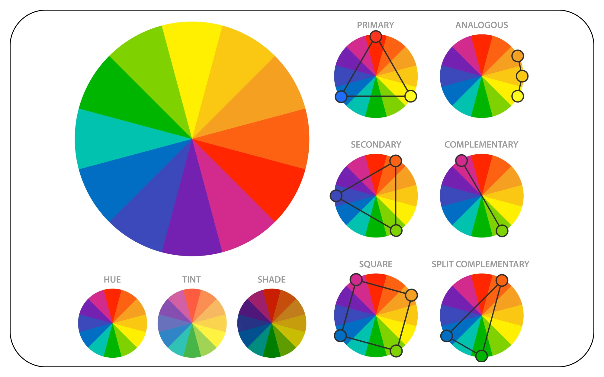
Primary Colors
Just like prime numbers, primary colors are unique. Standalone. You cannot create them out of other colors. On the color wheel, they are:
• Red
• Yellow
• Blue
These three colors are the building blocks of any color scheme, anchoring your design and opening the gate to more color combinations. But rarely do logos and websites use primary colors in their design.
Secondary Colors
Orange is a secondary color, and is associated with some of the biggest brands in the world. You obtain secondary colors by mixing any of the two primary ones.
• Orange = red + yellow
• Green = yellow + blue
• Purple = blue + red
Tertiary Colors
If you're wondering which colors work best together in a logo color scheme, tertiary colors are a great option. You obtain them by mixing a pure primary color with a pure secondary color (no shades, no tints, no tones).
From here on, color theory and logo/website design get a bit more complicated. One issue is that not all primary colors mix well with a secondary color to create a tertiary one. But, it is more of an issue for painters rather than logo designers. So let’s see the tertiary colors, as you will run into them a lot in the future:
• Magenta = red + purple
• Vermillion = red + orange
• Amber = yellow + orange
• Chartreuse = yellow + green
• Teal = blue + green
• Violet = blue + purple
So far, you have 12 colors to play with for any design you want to create, from logos to fashion lines. However, we all know the world (especially the digital one) does not stop at these twelve possibilities. So let’s go deeper with our color analysis:
Hues
Saying “color” is the same as saying “hue”.Hues are all primary and secondary colors. Think about the primary and secondary colors when you ask a designer to create a logo or when your logo maker prompts you to choose a dominant hue.
Shades
Adding black to any hue means adding shade to it. Most people refer to shades to describe the darker versions of the same hue. As we said above, a monochromatic logo can use diverse color shades. For instance, when you add black to blue, you get twilight.
Tints
A tint is the opposite of a shade. It means that you add white to a hue to make it lighter. For example, if you add a hint of white to red, you obtain pink. However, during regular conversations, people will refer to them as “light or dark” color shades.
Saturation (Tones)
We use the word “saturation” when discussing colors in the digital environment, whereas tones make it into painters’ conversations. Saturation refers to the amount of gray (black + white) added to a color.
Assuming you are not a painter but an entrepreneur, knowing these terms is not required of you. However, it would be best to navigate your way through “color talk” when you design your logo in case there’s an issue that demands your attention.
CMYK vs. RGB
Printer cartridges use the CMYK color model, and that’s not a coincidence. Nevertheless, we will keep things short, as we don’t want to delve into additive and subtractive color theory yet.
• CMYK stands for Cyan, Magenta, Yellow, Key (Black). It would be helpful to keep this color model in mind when you want to print your logo on business cards, leaflets, documents, etc.;
• RGB stands for Red, Green, and Blue. This model is prevalent in digital environments. When you need to pick colors for a logo or a website, you need to look for RGB numbers or HEX codes (codes assigned to color in CSS and HTML programming). RGB is your best bet when designing logos and other digital assets.
PRO TIP: if you used RGB codes for your digital designs, convert them into CMYK before printing them.
The Basics of Color Psychology When Choosing The Best Logo Colors
Any logo-making guide ever written says that a logo needs to trigger an emotion or a reaction in whoever sees it. Perhaps we will delve more into color psychology in the future, but for now, you need to know this: the use of color is cultural, personal, and very subjective. People from different cultures interpret colors differently, depending on several variables. There is also an individual aspect to this: some people shiver at the sight of yellow, while others have an adverse reaction to green.
If you are building a brand addressing international markets, be aware, mindful, and sensitive regarding your brand’s color scheme.
Color can do more than simply trigger an emotional response. We use it to create and evoke brand associations. By gaining a deep understanding of your audience, you will understand better how it responds to your colors. But what colors should you choose to get the desired reaction?
Red
Associated with fire, passion, energy, love, and power, red provokes your audience to engage with your website. Therefore, food, fashion, and entertainment industries usually use red logos. However, red is also associated with danger, so if you sell yoga & Zen meditation products, you might want to stay away from red.
Yellow
Yellow is a cheerful, friendly, and uplifting color. Yellow-centric logos inspire happiness and approachability. However, too much yellow can trigger the opposite reaction (as it also signifies danger), so use it wisely in your logo color schemes.
Blue
Evoking peace, relaxation, and elegance, blue is a logo color primarily associated with tech brands. You will frequently find it on financial websites, medicine, health & wellness brands, water-centric brands, etc. Lighter blue logos inspire tranquility, while darker blues suggest confidence and professionalism.
Orange
Warm, welcoming, and bright, orange is the go-to color of food, sports, and tech brands. It sparks joy and trust, so it is a fantastic color to depict your brand as fun yet very professional.
Green
Green is the color of nature, rebirth, and hope, and all things earth-related. It is mainly associated with beauty brands, eco-friendly markets, organic foods, sustainability industries, and tech startups.
Purple
Primarily associated with luxury, wealth, and wisdom, purple makes a brand look professional but approachable. For this reason, you will often see it as a brand color in the fashion and confectionery industries. Used with care in your branding color scheme, purple invites people to have some luxurious fun.
Black & White Logo Colors: The Foundation of Any Logo Design
Before we leave you to your logo design experiments, we have to talk a little about how you should begin your quest for the best logo color combinations. Of course, the answer is “design your logo in black and white first.”
They may not technically be colors, but you know what we mean. Black and white logos are timeless, elegant, sophisticated, and highly versatile. While minimalistic by nature, they can take on all shapes and sizes. You can use them in wordmark logos, mascots, letterforms, and so on without missing a beat regarding message and brand perception from the famous WWF or Calvin Klein logos to our Ucraft logo, black and white covers all industries and businesses.
Our advice for you is to create your logo first using only black and white. Then, after you have something you’re proud of, add colors to it. The colors should enhance and give personality to your logo, not define it per se. Sometimes, giving up on the bells and whistles is what makes you stand out from the crowd.
![]()
If the choice of logo colors is at the forefront of your branding efforts, make sure you create multiple color versions to test in both digital and print formats. For example, a yellow logo on a black screen will make your name stand out from the crowd, but a yellow logo printed on white paper will be almost invisible.
We hope this short guide on logo color schemes helped you better understand how to design your logo or how to communicate your preferences to a professional logo artist. Now that you know how to use colors to your advantage, your branding efforts will be unstoppable!
Ready to start creating your logo? Check out our free logo maker!