


Mobile-friendly website practices – are they necessary? The short answer is yes, they are vital. And if you need some hard facts proving this, here are a few:
-
As of 2022, 55.79% of global website traffic came from mobile devices (Statista)
-
74% of website users will return to a site if it is mobile-friendly (WebFX)
-
Customers are 67% more likely to make a purchase if the store is mobile-friendly (Forbes)
-
68% of companies that developed a mobile-first website saw a rise in sales (SAG IPL)
-
53.8% of web designers say “not being responsive on all devices” is a key reason why they redesign a website (GoodFirms)
Mobile-Friendly Websites: Then and Now
In 2013, the percentage of web traffic from mobile devices was just 16.2%, meaning that mobile traffic has more than tripled worldwide during the past decade. In line with this trend, Google has been rewarding mobile-friendly websites with higher search rankings and penalizing those that were not.
Today, more than half of all web traffic is mobile. What is even more interesting is that a recent Ericsson Mobility Report on smartphone analytics predicted a 25% increase in mobile traffic by 2025. To help you understand the big picture better, take a look at this infographic.
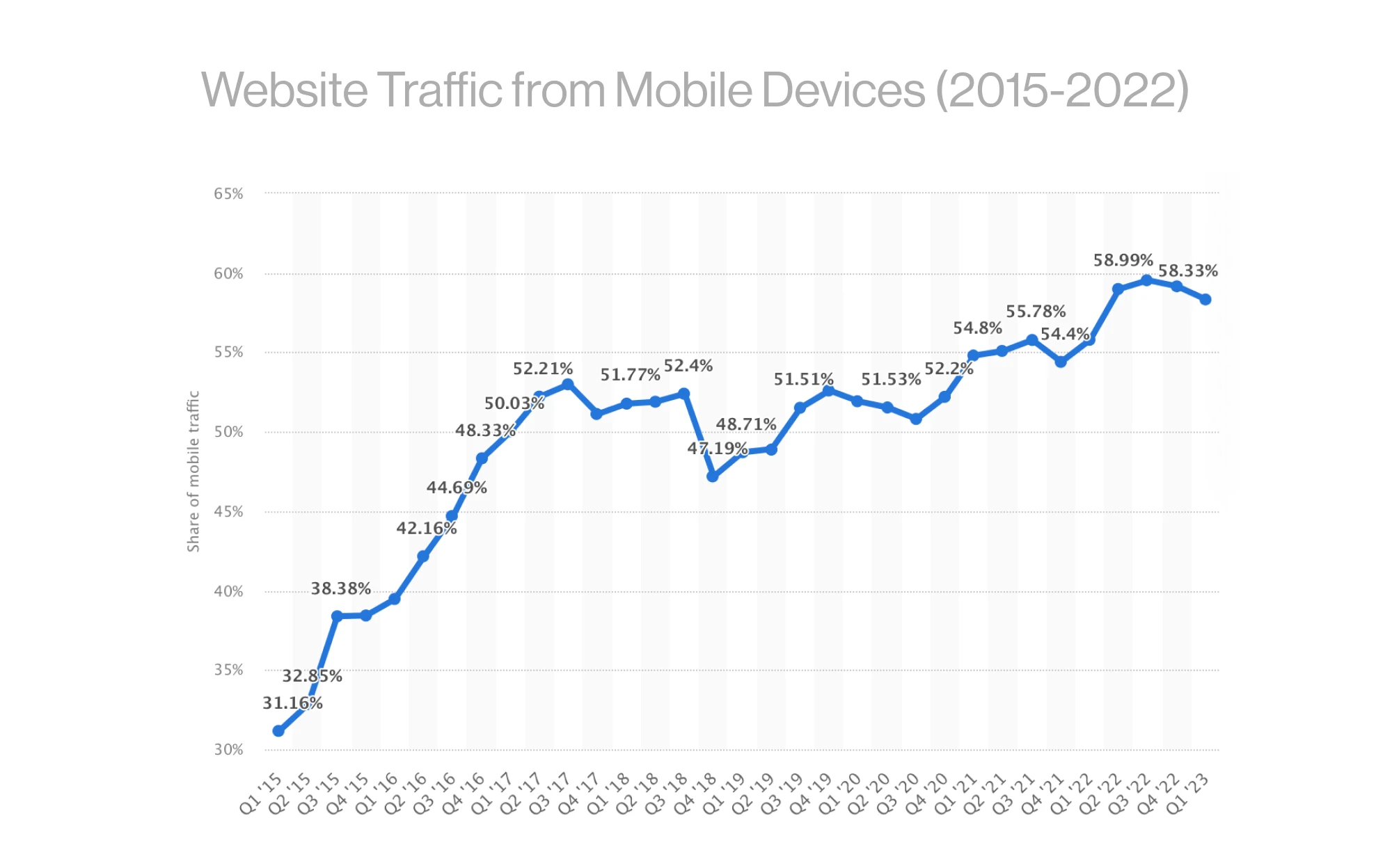
As you can see, mobile usability is on a meteoric rise, and all website owners need to embrace mobile-friendly practices to gain better Google rankings and conversions.
To help you develop a mobile-friendly website, we have compiled this guide of best practices. As a note, keep in mind that the Ucraft website builder accounts for many of the mobile-friendliness elements we describe in this article. However, if you're looking to build a robust online store, it might be beneficial to hire an expert to design your eCommerce website. Therefore, think of this guide as more of a "checklist" of tweaks to compare your website against while you design and optimize it.
Mobile-Friendly Websites: Starting the Right Way
Before we go any further, let’s see what it means to have a mobile-friendly website. We have talked about this before, but let's recap! According to Google;
Mobile-first indexing means Google predominantly uses the mobile version of the content for indexing and ranking. Historically, the Google index primarily used the desktop version of a page's content when evaluating the relevance of a page to a user's query. However, since most users now access Google Search with a mobile device, Googlebot primarily crawls and indexes pages with the smartphone agent going forward.
Google recommends website owners a few best practices to implement when creating mobile-friendly websites. Of course, it is just the tip of the iceberg you see here, as things are more complex. But let's begin with the obvious:
-
Avoid software not often found on phones – for instance, Flash.
-
Use legible, large text – at least 12 pixels on at least 60% of the page.
-
Employ content that auto-adjusts to screen size.
-
Add links that are far enough apart to click on each separately.
Now, more than ever, you should improve your website to comply with Google's Page Experience Update. Experts talk and will talk plenty about Core Web Vitals and page experience signals, but let's refresh our memory on mobile-friendly website design and what it means to have a high-ranking, optimized website:
-
Ensure that the Googlebot accesses and renders your content correctly;
-
Have the same content on desktop and mobile;
-
Ensure that the structured data you have on both versions of your site (desktop and mobile) is the same;
-
Optimize your metadata so it is the same on both site's versions;
-
Ads can harm your mobile page rankings, so make sure you follow the Better Ads Standard when you display ads on mobile devices;
-
Optimize and minimize all your file sizes to improve load time, a ranking factor you should not overlook. When it comes to videos, make sure they are not too large, heavy, or slowing down your mobile pages;
-
Improve overall page speed;
-
Make sure the layout and order of content makes as much sense as it does on desktop;
-
Before you publish website animations, make sure they work just as well on mobile as they work on the desktop version. Also, ensure that Google does not "see" animations on mobile as layout shifts;
-
Double-check if JavaScript works well on the mobile version, as it sometimes might not;
-
Disable pop-ups. Google calls them "intrusive interstitials," but you know it is all about those pop-ups that annoy users and lead to high bounce rates;
-
When you design or optimize your site for mobile, always have the "fat finger" principles in mind. Touch-screen navigation can lead to unwanted clicks. Ensure your buttons, links, images, etc., are not too big or too small or blocking the path of a thumb trying to scroll.
We will discuss these matters in more detail in a few moments. However, what you need to understand right now is that, essentially, a mobile-friendly website is an intuitive and easy-to-use experience to visit on a smaller screen.
9 Tips for Mobile-Friendly Websites
Here are the best practices and techniques for mobile-friendly websites!
#1: Design with Mobile-First Indexing in Mind
Since Google uses Mobile-First Indexing, it makes sense to use this technique yourself. While most visitors want to see similarities between your mobile and desktop versions – like content, colors, and themes – they will still expect the structure to be different.
The idea is to stick to the essentials. But what is relevant?
While you could show many different navigation tabs for a desktop site, experts recommend sticking to around 4 to 8 items for a smaller screen.
You can save space by eliminating the "Home" tab, for instance. Instead, place your company logo at the top-left of your mobile screen, and make it so that it takes users to the home page.
If you need multi-level navigation, keep it simple with a vertically oriented dropdown functionality. Skip Flash – no matter how tempting – as it may not be available on your user’s phone. Otherwise, those users will not get to enjoy any special effects that you created with the plugin.
Also, as Google and all experts say, be careful with pop-ups. They can be hard to close on mobile devices, resulting in a poor visitors' experience and high bounce rates.
If you take these tips seriously and design your website with a responsive mobile structure in mind, your mobile features will transfer to desktops, making them look the same.
#2: Perform Thorough Research If You Design Mobile after Desktop
If you don’t happen to have designed your website with mobile in mind, change is a little more difficult but not impossible. Your goal here is to start by gathering data using web analytics tools and UX design tips.
Some questions to ask at this point:
-
What content do visitors find most important?
-
What do they ignore?
-
What path do visitors usually take through your website?
If you use ads for revenue – do not remove them. But if they are a secondary profit source, consider eliminating them on mobile to keep your website fast and clean.
Lastly, run speed tests on different elements of your website. If any elements take a long time to load, consider whether they are critical to your website and whether you can reduce or eliminate them.
For reference – research by Google found that 53% of visitors would leave your mobile page if it takes longer than 3 seconds to load. Now, page load and speed are crucial ranking factors, so do not ignore them!
Your next step is to map out your content paths. A content path is a series of experiences that take your visitors to the desired outcome (i.e., a sale). Then, once you have wireframed them, you can start piecing them together with Ucraft's templates.
#3: Write Content with Mobile-Friendliness in Mind
The next best practice tip for mobile-friendly websites is all about content. Namely, writing content with mobile in mind. A common mistake is to squish content or reduce font sizes to fit smaller screens.
Rather than awkward formatting or endless zooming and sliding around the screen, ask yourself what content is most important and how much of it people can easily read and digest on a given screen size?
Here are a few suggestions to get started:
-
Add in large, descriptive buttons. Apple suggests a size of 44x44 pts.
-
Increase font size. Choose at least 16px, with a line-height of 1.5.
-
Skip mouse-over and hover effects.
#4: Optimize the Navigation and the Home Page
In addition to minimizing items listed on top of your website, keep in mind the following factors to help visitors easily navigate across a mobile device.
4.1. Very Important Pages
Give visitors the most critical web pages first. Then, if you have a website together with access to traffic analytics, take advantage of it. In addition, ask yourself a few more questions:
-
Where are visitors going the most?
-
What pages aren't they visiting?
-
If you're using a silo strategy, which category pages are at the top?
-
What actions do smartphone users take most often on your website?
-
Which pages on your website take visitors to what they came for most quickly and straightforwardly?
Let your answers guide you in creating new content in an educated manner.
4.2. Search = Navigation
If your website is complex – like a large eCommerce site with many product categories, items, sizes, colors, etc. – consider including a search box rather than additional dropdown menus. Make sure to set up your search bar for different additional search terms and test to see if it works.
4.3. Navigation should be intuitive
All the work you've been doing so far has made your website intuitive and easy to use. The next step is to keep the menu straightforward. Some examples include adding a magnifying glass next to your search bar to clarify each feature's purpose. A few stacked lines can indicate a menu.
Let's hear what Google has to say about the home page, navigation, menus, and more:
-
Keep calls to action front and center. Make secondary tasks available through menus or "below the fold" (the part of the webpage that people can't see without scrolling down). Make all of your users' most common tasks readily available.
-
Keep menus short and sweet. Mobile users don't have the patience to scroll through a long list of options to find what they want. Instead, reorganize your menu to use as few items as possible without sacrificing usability.
-
Make it easy to get back to the home page. Users expect to go back to the homepage when they tap the logo (usually placed in the top-left of a mobile page), and they become frustrated when it isn't available or doesn't work.
-
Promotions (especially large app install interstitials such as full-page promotions that hide content and prompt users to install an app or download content) should be easily dismissible and not distract from the experience.
4.4. Display Your CTAs as Clearly as Possible
Speaking of CTAs, did you know that people should spot CTAs on mobile in less than two seconds? It is what the experts suggest, so businesses have a competitive edge. As you saw above, Google itself recommends you make your buttons visible front and center. While best practices for mobile-friendly websites encourage you to display calls to action so that anyone can see them and interact with them in the blink of an eye, balance is still key. Do not overwhelm your site with buttons and links, as they will confuse, distract, and annoy people using small screens.
4.5. Don't forget multiple screens
Your most interested visitors will likely visit your website repetitively and on multiple devices. So, keep your colors and themes the same, no matter the device.
Here are a few more questions to consider:
-
Can your visitors find your essential information, like address, phone number, or email, easily?
-
Should you include a "call" button or store locator on your website?
Let's see an answer to this last question. What is the best practice of a mobile-friendly website? First, streamline the user experience so they can enjoy what you have to offer in as few steps as possible. In other words, you should take the most advantage of all website interactions on mobile and turn everything into a seamless user experience. If you have an eCommerce website or any business relying on people contacting you, the easiest way to provide a seamless marketing funnel and customer service experience is to make it easy for clients to contact you.
Here are some tips:
-
Make your phone number a clickable link (Click-to-Call);
-
Clicking your headquarter/shop address should open up the Google Maps app (that works!);
-
Add short forms to make it easier for users to contact you or finish a purchase. We will talk more about forms in a few moments.
#5: Optimize Images to Boost Speed
You might feel we are repeating ourselves, and you are not wrong. We do, but for the right reasons. Website speed has such a big impact on the user experience and the customer journey, that, according to a 2022 study by Portent, websites that load in 1 second have a conversion rate 3 times higher than websites that load in 5 seconds.
And when it comes to boosting speed, image optimization is one of the hottest topics in web design and SEO.
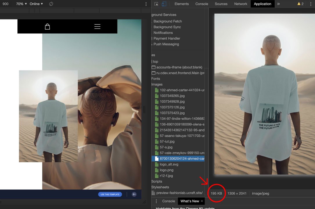
All images need to load quickly to avoid slowing down your loading time. To accomplish this, you need to optimize your images for mobile through either:
1. The old method: scale images by manipulating code. This keeps the file size the same but allows it to scale in size with the screen. But, this sometimes still results in longer load times.
OR
2. The newer method: scale the images using HTML markup. This stops the visitor's browser from downloading larger images than necessary. Unfortunately, not all browsers support this yet.
There are easier things you can try, too. For instance, when selecting images, pay attention to the file size, consider the format (i.e., JPG or PNG), resolution, and file name. Reduce as much as possible without destroying image quality.
#6: Boost Speed by Reducing HTTP Requests and Combining Files
When a user lands on your website, their browser will send a request to the server for the files it needs to load the site – and each file needs its own request. It happens every time they visit a new page. The more files needed, the longer the page will take to load.
Naturally, you would think reducing the number of file requests as much as possible would be the solution – and you would be right. But the problem here is that if you reduce the number of HTTP requests down to just one, it will be huge, resulting in a noticeable increase in website load time. Using smaller image sizes is an excellent place to start.
#7. Optimize the Forms on Your Mobile Site
Let's return to forms for a bit, as promised. The longer the form on a mobile device is, the more we have to type. Typing endlessly on mobile is annoying, even to the tech-savvy generation. The more annoying a website is, the faster we bounce away from it.
In other words, keep your forms short. Asking for too much information and forcing users to type or fill-in tiny fields or boxes puts users off quickly. Some forms are indeed mandatory – such as shopping checkout ones. However, here are some suggestions on how to optimize forms on mobile:
-
Ask only for relevant information;
-
Double-check your forms for errors and make sure you make all checkboxes visible and accessible;
-
If your users need to pick a date, a visual calendar can prove extremely useful;
-
For every field in the form, opt for the simplest, most intuitive input methods;
-
In some cases, predictive text works well;
-
Refrain from redirecting the user to a new page unless it is necessary.
#8. Typography Matters More than You Think
Have you ever visited a website on mobile only to stumble upon tiny fonts, endless walls of text, or colored headings that made no sense? Unfortunately, these things still happen. So let's understand reality better:
-
Large blocks of text deter mobile users, as they have to scroll continually to reach the point you are trying to make (or the CTA you are trying to convince them to click).
-
Experts do not recommend you to use many different font sizes on the same page. Nevertheless, if you do, ensure you make your points of focus very clear.
-
Decide on a visual hierarchy and stick to it, even when you choose and use fonts.
-
Font size matters. Remember that your users – of any age and visual prowess – use plenty of screen sizes, so all texts should be readable and understandable no matter what.
-
The font type matters even more. Consider choosing simple, clear, and crisp fonts because no user should spend time or effort deciphering specific typography. They call them web-safe classic fonts for a reason. Instead, use specific fonts that adhere to UI/UX design principles and always keep minimalism at the forefront of your design.
#9: Test Your Website
As mobile-friendly websites go, testing your website every step of the way is probably the best practice to take to heart.
So by now, you have:
-
put together your website using Ucraft’s templates with mobile in mind;
-
optimized your content for different screen sizes, keeping font types and sizes in mind;
-
made everything touch-friendly;
-
arranged the Home page and navigation; and
-
chosen smaller images or played with code.
That means you are ready to go live, right? Not quite.
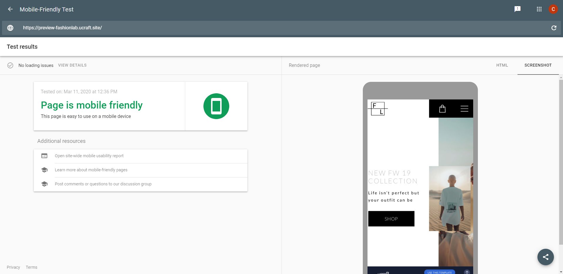
Here comes arguably the most critical step: testing your website for mobile friendliness. The simplest way to do this is to use Google's Mobile-Friendly Test. Once you publish your website, you can pop in your URL, and Google will run a test with its "Googlebot smartphone."
You'll get a rating, in addition to the option to click through and see if there were any page loading issues. Here, you will get a complete list of pages with the load errors that showed up.
In addition, you should use other testing tools, like Browserstack and Web Developer. But what is the best way to test your website out for mobile friendliness?
Real-life testing. Using an actual device gives you the most accurate way of gauging how your mobile site will respond in reality. Grab as many different devices as you can and visit your website on them: iPhone and Samsung smartphones, iPads, tablets, etc.
When you do so, keep a checklist in mind:
-
How does the website look on each device? Great, or not-so-great?
-
Are there any bugs? On which devices, and what kind?
-
Is the UX friendly enough? For example, can you easily tap the button you want without suffering from "fat thumb" syndrome?
Of course, there are many devices out there – cost and time investment can make it impossible to test them all. If that's your case, use the tools linked to above or try out emulators or simulators – anything within your resources to ensure mobile-friendliness.
Mobile-Friendly Website Design and Optimization: FAQs
Before we leave you to your design and optimization tasks and to make things even more apparent to you, let's answer some of the most frequently asked questions we get from our users!
What is a Mobile-Friendly Website?
A mobile-friendly website is one that ensures a consistent user experience across a range of mobile devices. With Ucraft you can build an advanced website or online store that works perfectly across a range of modern devices. Every Ucraft template is designed with mobile-friendliness in mind.
What is Responsive Web Design?
Using this technique means that your HTML and your URL remain the same when visited on mobile. In addition, everything about your website adjusts to any screen size.
Google itself recommends Responsive Web Design. Here are some advantages:
-
The layout is flexible, detecting screen size and orientation automatically;
-
The website's UX is similar across all browser and device types;
-
You only need one URL.
In short, responsive web design is built with one layout and scales down (or up) appropriately based on device resolution through media queries and CSS manipulation techniques. So, for example, you could build it so that an image on a page always takes up 30% of the web page, regardless of the screen width, and the other 70% scales accordingly. This way, you're guaranteed to cover for all possibilities and serve a web page optimized for each device.
It seems complicated to do it by yourself, as website responsiveness implies you have to design infinite layouts for infinite screen sizes, which, of course, involves a lot of coding. However, things are easier than they seem. If you use Ucraft as your website builder, you can easily choose website templates that allow you to design a mobile-responsive website without learning how to code.
What is Dynamic Serving?
The dynamic serving technique uses the same URL no matter the device, but the code version is different depending on the device. But is it ok to have more than one configuration on your website? Google says it is.
It is OK to use more than one configuration for your site. Check that on a page-level basis; each configuration provides the correct indications to search engines. If you're using a hybrid responsive design (for example, responsive but with images dynamically served), Google still considers that responsive since the page is nearly the same.
Can I Create Separate URLs for Desktop and Mobile Versions?
Yes, you can. This technique creates an entirely separate URL for the desktop and the mobile version, respectively. Typically, the mobile version looks something like www.m.yourdomain.com or www.yourdomain.com/mobile. You can have a standalone mobile website version without a desktop equivalent. Google recommends that a mobile-only website version build a reputation on its own (unique, relevant, high-quality content, good internal and external links, optimized files, etc.).
With these questions answered, let's dive into our checklist!
Is the Google Mobile-Friendly Test Result the Same with Google's Page Speed Insights UX Score?
We will let Google itself answer this question, as this is their game!
The Mobile-Friendly Test uses Googlebot to fetch the page. PageSpeed Insights does not use Googlebot but fetches the page to mimic how a real user fetches the page. It means that the Mobile-Friendly Test follows robots.txt rules and PSI does not. If Googlebot is blocked from fetching the page, JavaScript, CSS, or other resources, the Mobile-Friendly Test may not detect a mobile-friendly page. To find out if your page is mobile-friendly, use the Mobile-Friendly Test.
Conclusion
Given the research, it's integral to design your website to be mobile-friendly. Google ranks websites by judging their mobile-friendliness, and people use mobile devices more than desktops to access the internet. And with so many different screen sizes, your website needs to be capable of adjusting to each one.
So to summarize our "checklist" for a mobile-friendly website:
-
Go with a Responsive Web Design if possible. It will keep your site interface the most similar across a wide array of devices and maintain a single web address.
-
Focus on designing for mobile-first – do that, and the desktop version will take care of itself.
-
When putting the site together, increase your font size, skip mouse-over type effects, and keep buttons large and separate, so they're easy to tap.
-
Don't forget to optimize images and combine files to reduce load time.
-
Take care of the content you write and the typography you use.
-
Keep all your forms short and relevant.
-
Lastly – test your site (at every stage if you can). Use real devices when possible.
Run through, test, and tweak these things and you'll be well on your way to a mobile-friendly website and higher Google rankings.