


Your logo is the face of your brand - it's often the first thing potential customers see and remember. Creating a memorable logo requires careful planning, creativity, and an understanding of design principles. Fortunately, modern design tools make it possible to create professional-looking logos without spending years learning design skills.
This guide will walk you through the essential steps to craft a logo that captures your brand's essence and speaks to your target audience.
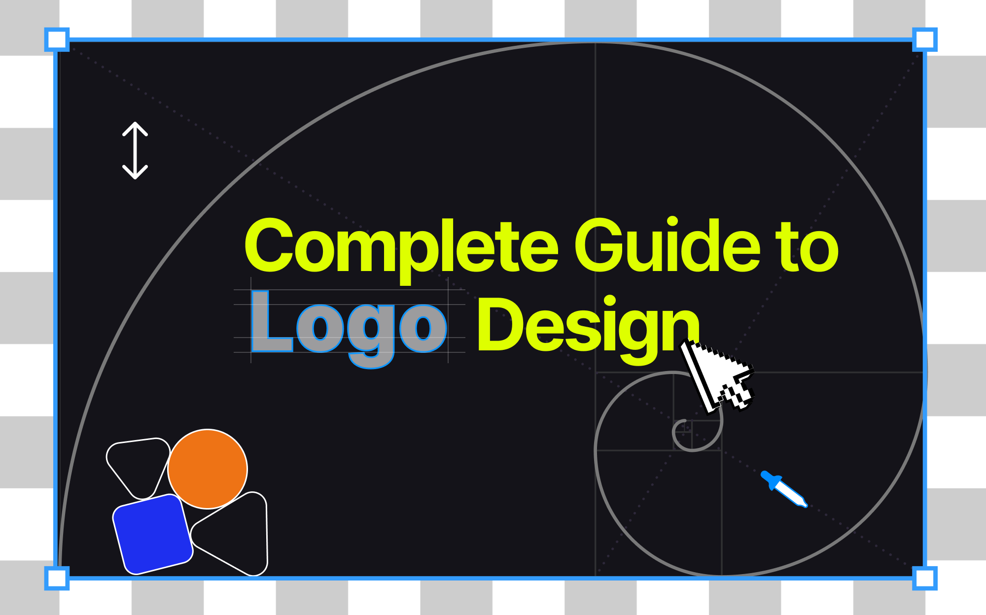
How to Design a Logo from Scratch
For those wondering how to design a logo for beginners, it's important to understand that creating a powerful logo involves more than just combining attractive graphics and text. It requires strategic thinking and a deep understanding of your brand, market, and customers. A well-designed logo should be versatile, memorable, and effectively communicate your brand's personality.
-
Define your brand personality
-
Research your target audience
-
Do competition analysis and gather inspiration
-
Select the logo style
-
Sketch your initial concept
-
Choose your color palette and typography
-
Create variations
-
Test across different media
-
Refine based on feedback
1. Define Your Brand Personality
Before diving into design, take time to articulate your brand's core essence. The best way to design a logo is to lay the groundwork first - get clear on your mission statement, what you stand for, and who you really are as a brand. Only then should you start designing.
What makes your brand unique? Are you innovative, traditional, luxury-focused, or approachable? Document your brand's voice – is it professional, casual, authoritative, or friendly? Create a mood board that visually represents these qualities through colors, images, and stylistic elements.
Consider your industry positioning and how you want to be perceived in the market. This foundation will guide every design decision and ensure your logo authentically represents your brand.

One effective way to solidify your brand's identity is to align it with one of the twelve brand archetypes – universal character types that resonate with human psychology. From the bold Hero (like Nike) to the wise Sage (like Google) or the creative Artist (like Adobe), each archetype represents distinct traits and values. Understanding which archetype best matches your brand will help inform your logo's style, color choices, and overall visual direction. Let's explore these archetypes and how they influence logo design:
Pro Tip: Write your brand description twice - once in technical terms and once as if you're describing it to someone at a party. The contrast between these descriptions often reveals hidden brand personality traits that can inspire unique logo elements.
2. Research Your Target Audience
Understanding who you're designing for is crucial for creating a logo that drives your brand forward. Develop detailed personas of your ideal customers, including their demographics, preferences, and behaviors. What visual styles appeal to them? What cultural factors should you consider? Study the brands they currently engage with and analyze why these connections exist.
Consider generational differences in design preferences and how they might impact your logo's reception. Conduct surveys or interviews if possible to gather direct insights. This research will help you create a logo that not only looks good but effectively communicates with your intended audience.
Pro Tip: Search for your target audience's Instagram "saved collections" folders related to your industry – these curated visuals often reveal their unconscious style preferences better than what they say they like in surveys.
3. Do Competition Analysis and Gather Inspiration
While maintaining originality is definitely important, studying successful logos in your industry provides valuable insights into effective design approaches. Look beyond direct competitors to discover diverse design solutions across different sectors.
Create a collection of logos you find inspiring, noting specific elements that work well. Pay attention to color combinations, typography styles, and symbol usage that could influence your design. This research helps you understand what works in your market while identifying opportunities to differentiate your brand.
Analyze current design trends but remember that trends come and go – your logo should remain relevant for years.
Pro Tip: Look at your competitors' logos from 5-10 years ago using the Wayback Machine. This reveals which elements they kept and which they changed, helping you identify truly timeless design elements in your industry.
4. Select the Logo Style
Your logo style choice sets the foundation for your brand's visual identity. Before selecting a specific style, consider your brand's personality, industry standards, and where your logo will primarily appear.

Wordmarks are text-only logos that spell out your company's complete name using distinctive typography. This style works exceptionally well for companies with strong, memorable names or those wanting to build name recognition. Examples include Google, Coca-Cola, and Disney, where the brand name itself becomes the visual element.

Lettermarks (or monogram logos) use initials or abbreviated versions of longer business names. They're ideal for companies with lengthy names that need something more concise and memorable. Think IBM, HBO, or CNN. This style is particularly effective for business cards and social media profiles where space is limited.

Pictorial marks use recognizable images or icons as their primary element. These logos rely on a strong visual symbol to represent the brand, like Apple's apple or Twitter's bird. This style works best for established brands or when the image has a clear connection to your business name or service.

Abstract marks employ geometric forms or unique symbols to convey your brand's values. Nike's swoosh and Pepsi's globe are prime examples. These logos can be powerful because they allow you to create something truly unique that conveys a specific feeling or idea about your brand.

Mascot logos feature illustrated characters that represent your brand. They're excellent for companies wanting to appear approachable and family-friendly. Think of the KFC Colonel or Mr. Clean. These logos add personality and can be particularly effective for brands targeting families or younger audiences.

Combination marks merge text and symbols, offering the best of both worlds. They're versatile and work well for new businesses because they connect your brand name directly to a visual element. Examples include Burger King's text with crown or Lacoste's text with crocodile.
Pro Tip: When choosing your style, consider scalability (how it looks at different sizes), versatility (how it works across different media), and longevity (will it still look relevant in five years). Your choice should align with your industry while helping you stand out from competitors.
5. Sketch Your Initial Concept
Let's dive into the most creative part of our “How to Create a Logo from Scratch” guide. Begin the process with pencil and paper, allowing yourself to explore multiple concepts quickly without technical constraints. Start with rough sketches, focusing on basic shapes and arrangements. Don't limit yourself - sketch every idea that comes to mind, no matter how unconventional it might seem.
This exploratory phase is crucial for developing unique concepts that can evolve into your final logo. Keep your sketches simple enough to work at small sizes and maintain their impact in black and white.
Pro Tip: Try the "30-second sketch" technique – set a timer for 30 seconds per sketch and create 20 different versions. The time pressure bypasses your internal critic and often leads to more innovative ideas than careful, planned sketching.
6. Choose Your Color Palette and Typography
Color and typography significantly impact how your logo communicates your brand's personality. Select colors that align with your brand's emotional attributes and industry standards, while considering color psychology and cultural implications.
Limit your palette to ensure versatility and cost-effective printing. For typography, choose fonts that complement your logo's style and maintain legibility across different sizes. Consider creating custom letterforms to make your logo unique. Test different font weights and spacing to find the perfect balance. Remember that your logo should work well in both color and monochrome versions.
Pro Tip: Test your logo colors using the "coffee stain test" – print your logo in color, spill coffee on it, and let it dry. If your logo still looks good with coffee stains, you've chosen a robust color palette that can withstand real-world wear and tear.
7. Create Variations
Transform your chosen concept into a polished digital design using vector software like Adobe Illustrator or Inkscape. This ensures your logo remains crisp at any size. Create multiple versions optimized for different uses: horizontal and vertical layouts, with and without taglines , and simplified versions for small applications.
Establish clear spacing rules and size limitations to maintain your logo's integrity across all applications. Export your logo in various file formats suitable for different media, including print and digital platforms.
Pro Tip: Create a "micro version" of your logo that's recognizable at just 16x16 pixels (favicon size). This ultra-simplified version often reveals which elements of your logo are truly essential and which might be unnecessary decorations.
8. Test Across Different Media
Subject your logo to rigorous testing across various applications and contexts. Check how it appears on business cards, websites, social media profiles, and large-format displays. Test its legibility at different sizes, from favicon to billboard dimensions.
Evaluate how it looks on different backgrounds and in various lighting conditions. Consider how it performs in black and white, reversed out of dark backgrounds, and embroidered on fabric. This testing phase helps identify any practical issues before finalizing your design.
Pro Tip: Use the "moving car test" – have someone drive past your logo at different speeds while you stand at varying distances. If you can recognize and remember it in these brief glimpses, you've created a truly memorable design.
9. Refine Based on Feedback
Gather feedback from stakeholders, potential customers, and design professionals. Pay attention to first impressions and emotional responses. Ask specific questions about legibility, memorability, and brand alignment. Use this feedback to make informed refinements to your design.
Don't be afraid to make bold changes if the feedback consistently points to specific issues. Remember that your logo should communicate effectively to your target audience rather than just please personal preferences.
By following these steps methodically, you'll create a logo that truly represents your brand and resonates with your audience. While the process requires time and attention to detail, each step builds upon the previous one to ensure a thoughtful, effective result. However, if you're looking for an alternative approach, there's another option worth considering.
Conclusion
Whether you choose to design your logo traditionally or use AI assistance, remember that your logo is an investment in your brand's future. Take time to develop a mark that truly represents your brand and speaks to your target audience. A well-designed logo will serve as a strong foundation for your brand's visual identity and marketing efforts for years to come.
Now that you understand how to create a business logo, you can confidently begin the design process and create a memorable symbol that sets your brand apart.